Examples of ARM Dashboards that can be Achieved using Analytics
Here are some examples of what can be achieved with the ARM’s new analytics feature. For these examples, Microsoft’s Power BI data visualization tool was connected to the ARM database. [Other external tools besides this tool can be used]. The tool provided these interactive visualizations and business intelligence capabilities.
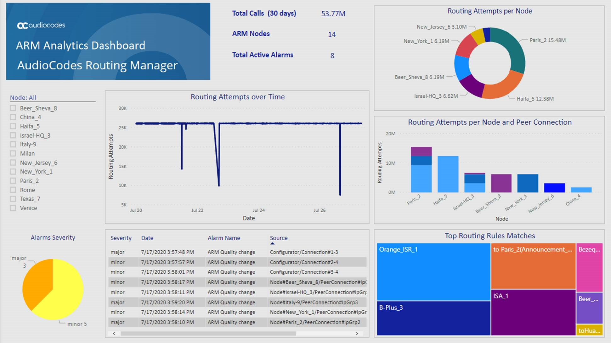
The Dashboard example below shows the total # of calls handled over 30 days, the # of ARM nodes and the total # of active alarms.
| ■ | The left side of the screen shows the filter and a pie chart showing Alarms Severity. |
| ■ | The middle of the screen shows routing attempts over time and a breakdown of the active alarms. |
| ■ | The panes on the right side of the screen show (top to bottom) a pie chart indicating # of routing attempts per node, a bar chart indicating # of routing attempts per node and peer connection, and top Routing Rule matches. |
Dashboard Example 1
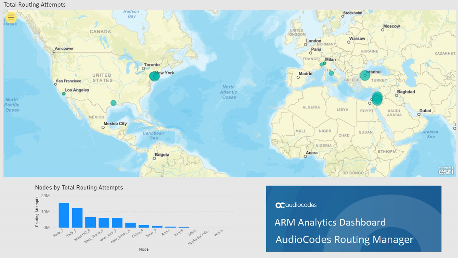
The Dashboard below shows how the total # of routing attempts was distributed across the nodes in the network.
| ■ | Smaller green balloons = smaller # of routing attempts |
| ■ | Larger green balloons = higher # of routing attempts |
Dashboard Example 2
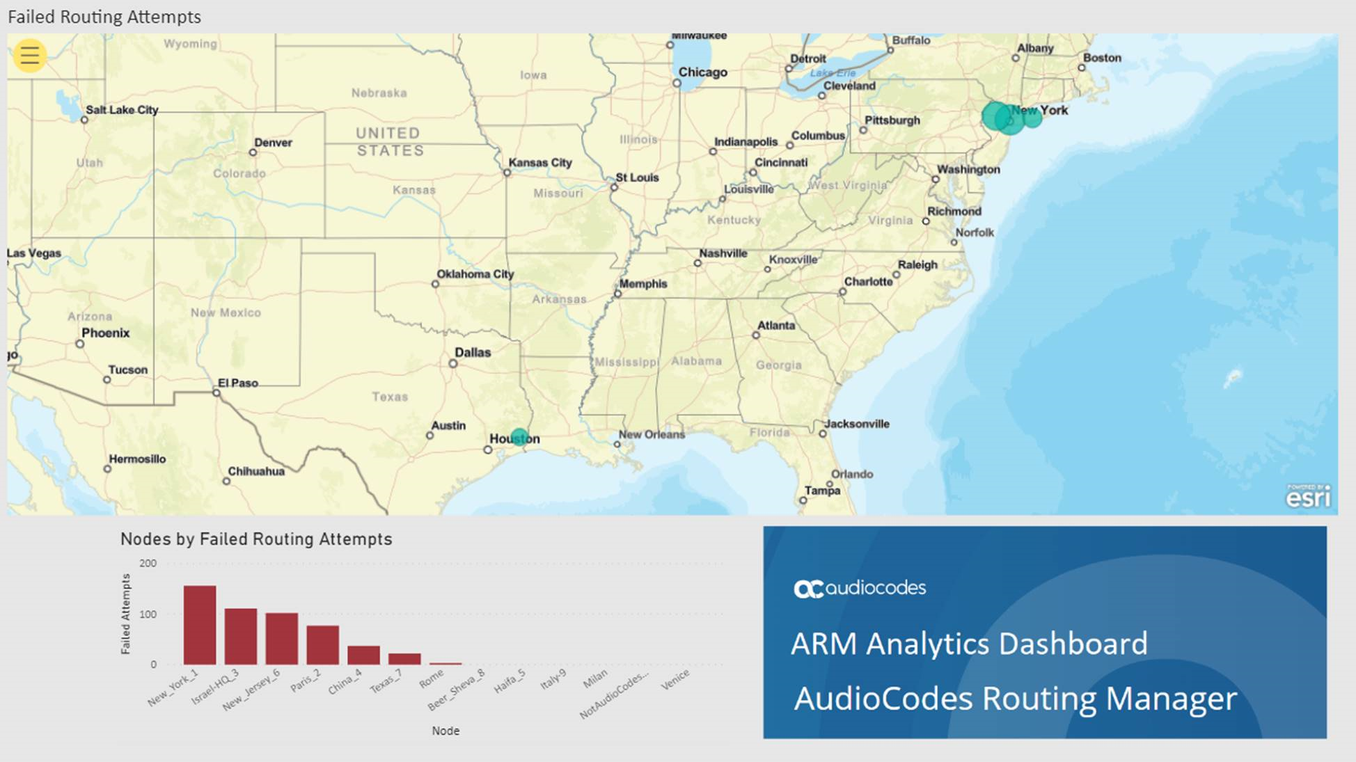
The Dashboard below shows how the total # of failed routing attempts was distributed across the nodes in the network.
| ■ | Smaller green balloons = smaller # of failed routing attempts |
| ■ | Larger green balloons = higher # of failed routing attempts |
Dashboard Example 3