
Metrics
The Metrics screen charts your account's call activity, and lets you build your own charts. You select the measures you need, set how each one is charted and how wide it sits, and arrange them into tabs that you return to.
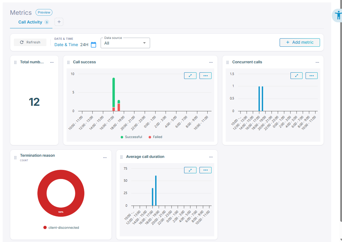
The metrics you can add are drawn from three sources:
- Call statistics — measures such as call success, concurrent calls, and average call duration.
- Predefined metrics — collected by Live Hub during calls, including bot latency and LLM and tool activity.
- Insights — your own metrics, produced by post-call analysis, such as sentiment or escalation risk. An insight you create there appears here and behaves like any other metric, and its chart colors are assigned automatically. See Chart colors.
Build a tab
Metrics are organized into tabs. A new account starts with Call activity; you can add up to 10 tabs, each holding up to 50 metrics.
- Add a tab: Click the + beside the tab names. Select a tab to open it, double-click it to rename it, and drag it to reorder.
- Delete a tab: Click Delete tab, and then confirm. The tab and its metrics are deleted together. This is irreversible and cannot be undone.
To add a metric:
-
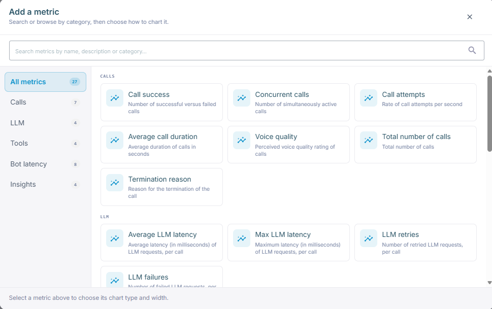
Click Add metric.
-
Find the metric: browse the categories Calls, LLM, Tools, Bot latency, Quality, Billing, and, where your account has post-call-analysis metrics, Insights, or search by name, description, or category.
-
Select it, and then set how it is drawn:

- 'Chart type' — Number, Bar, or Donut, depending on what suits the metric.
- 'Aggregation' — how the metric's values are combined: Average, Sum, Min, Max, or, for Billing metrics, Last. The options depend on the metric, and a metric with a fixed aggregation, such as Average LLM latency, skips this setting.
- 'Width' — how many of the tab's six columns the metric takes. Use Narrower and Wider.
-
Click Add metric.
Once a metric is on the tab, drag it to move it, drag its edge to resize it, and use its Metric options menu to open it full screen, add a threshold alarm for it, or Remove it. Add threshold alarm opens the Thresholds tab with a new alarm pre-filled for that metric. See Add or edit a threshold alarm. The layout is saved automatically.
Chart colors
Some metrics have a fixed set of values, and each value is shown in a predefined color. These metrics are:
- Call status
- Termination reason
- Call side quality
- Call min quality
The colors mean:
| Color | Meaning |
|---|---|
| Green | A good outcome, such as success |
| Red | A bad outcome, such as failure |
| Orange | A warning, such as busy |
| Blue | A category with no good or bad meaning, such as transferred |
| Gray | No information, such as unknown |
If a metric has several values of the same kind, such as several good outcomes, each value is shown in a different shade of the same color. For example, in Termination reason, bot-disconnected and client-disconnected are both good outcomes, so both are green, one darker than the other.
Insights metrics with a fixed set of values use the same colors, assigned automatically. To change the colors of an insight, edit its Description in post-call analysis so that the description states clearly what each value means.
Filter and drill into calls
Above the metrics, two filters control what the metrics show:
- Date & Time — the period to report on.
- 'Data source' — narrows the metrics to one connection, instead of the whole account. The default, All, covers the whole account.
Click the refresh icon to reload the numbers after changing a filter.
Some metrics let you go one step further: click the metric and call history opens, already filtered to the calls behind that number, for example, from a spike in average duration on Tuesday to the calls that caused it.